Featured Projects
Central Park Go
Blockchain
Olivia's Cupcakes
770-TREE-GUY
SISO Air
Blane Rudd
Outlaw Roofing
Kobella
Portfolio
Sign In
My Account
Featured Projects
Central Park Go
Blockchain
Olivia's Cupcakes
770-TREE-GUY
SISO Air
Blane Rudd
Outlaw Roofing
Kobella
Portfolio
Sign In
My Account
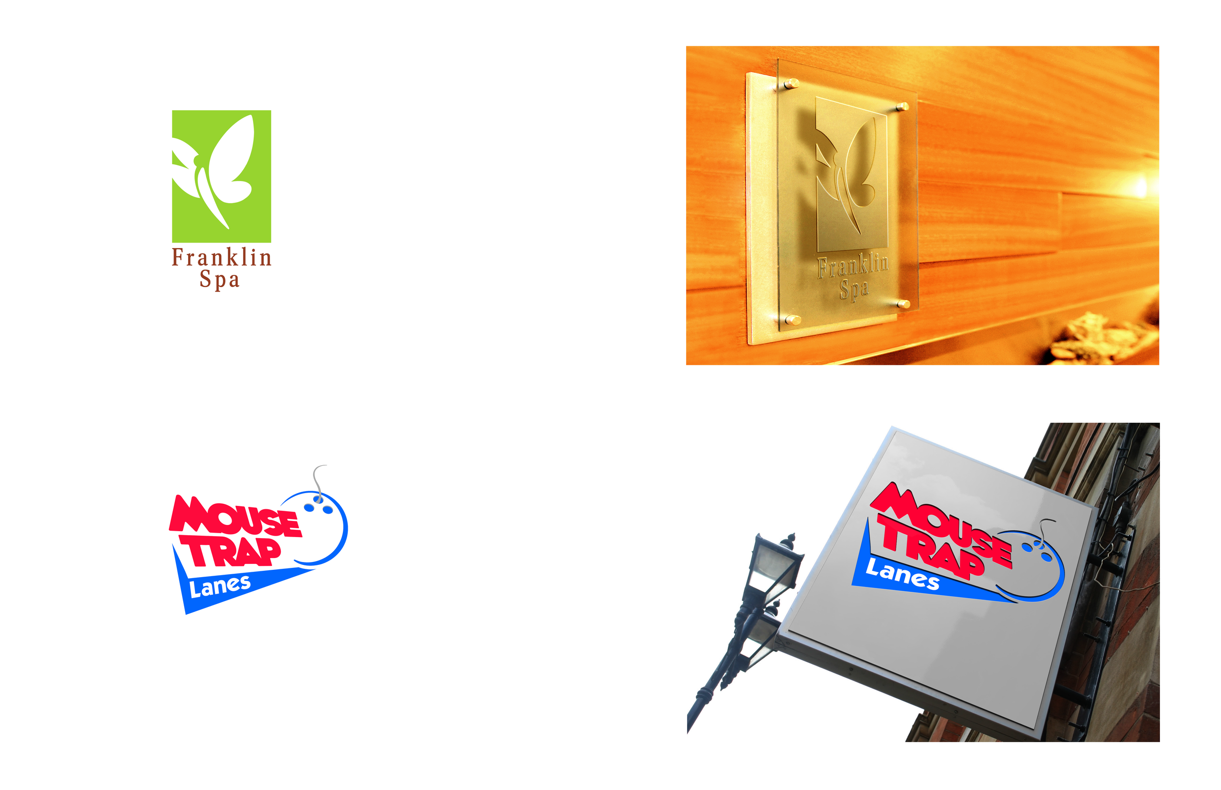
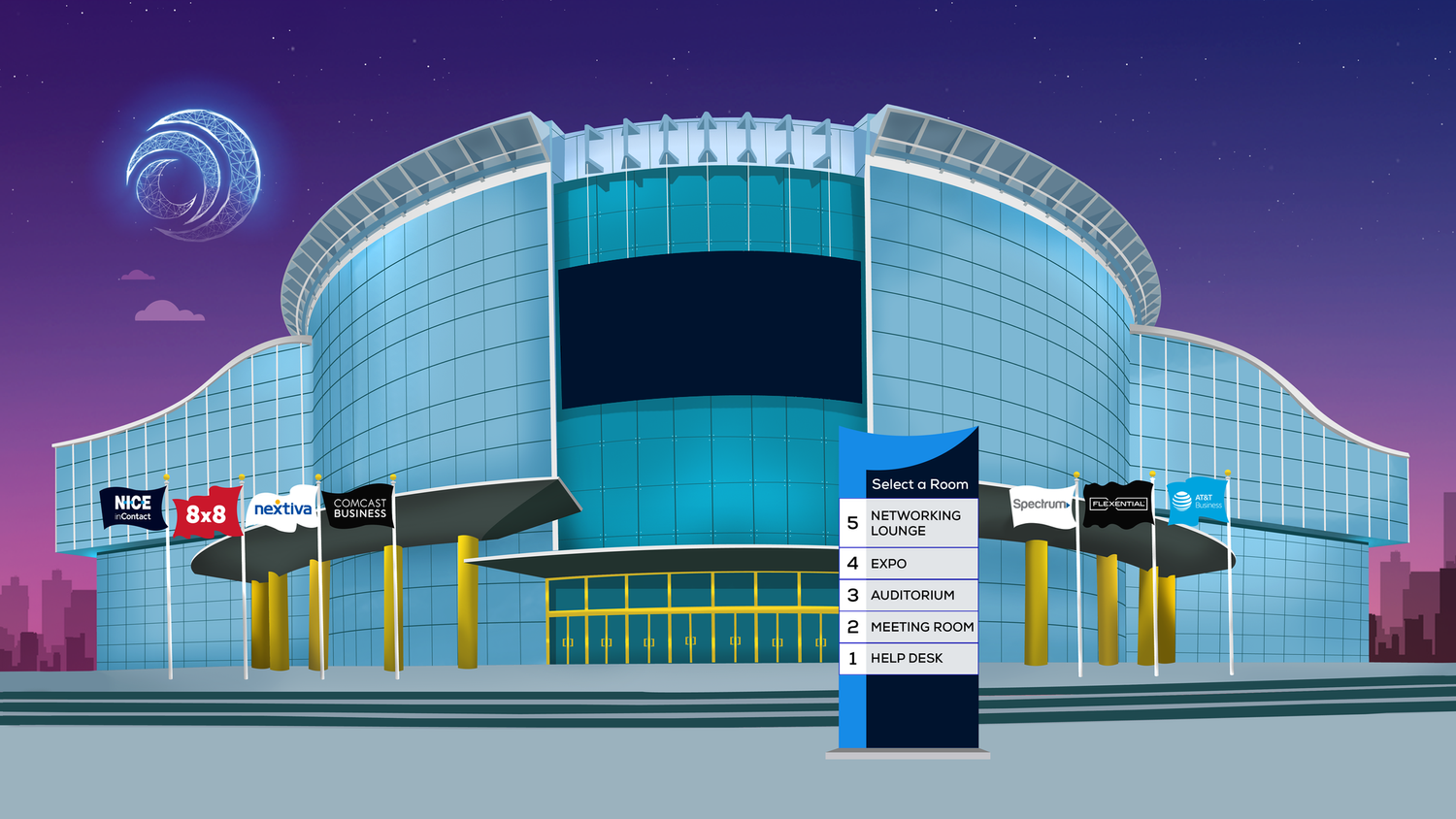
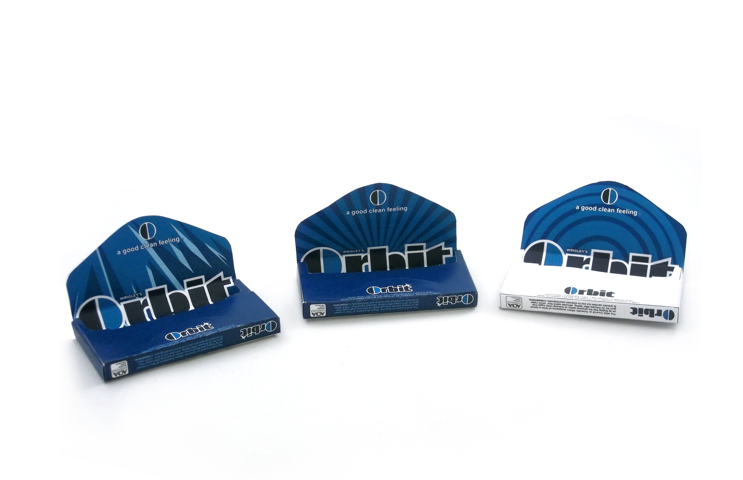
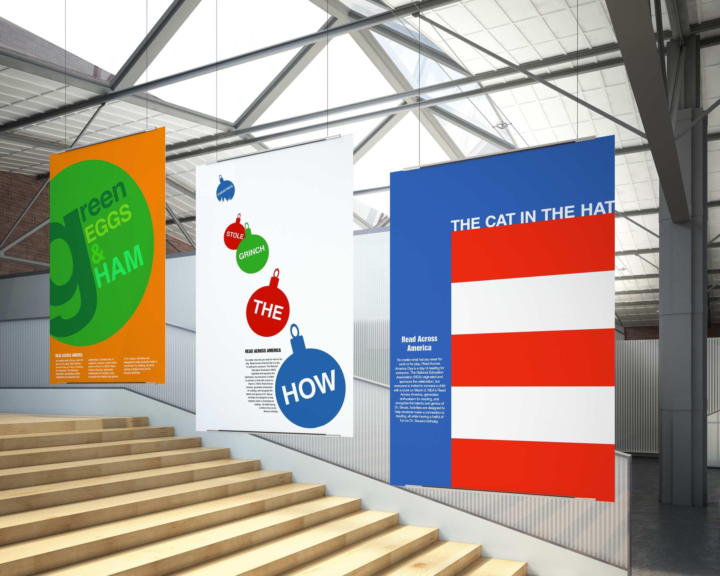
Portfolio
View Project
×